Pick three.
Get them all right.
A mobile prediction experience designed from scratch as part of a combined UX/UI and marketing take-home.
Three parts.
One test of how I think.
The exercise separated business thinking, product design and the reasoning behind the work. The screen was only one part of the answer.
What to ask before designing. How to decide when five teams want different things. What to do when the flow changes two days before launch.
A free-to-play landing page: predict 1, X or 2 on at least three random matches, confirm, and get a ticket. In the brand's look and feel.
The three key decisions, the assumptions, what to test if conversion is low, and where AI helped. AI use was allowed if disclosed.
Questions that
change the solution.
Product asked for a landing page “ready next week”. I wouldn't start until the business, audience and market context were clear. Each answer could change what the page leads with.
Business + user + market context → grounded decisions, not guessed solutions.
One critical path.
Five agendas.
The brief presented five competing stakeholder positions. I treated them as inputs to evaluate, then ranked what the first screen had to do and moved the rest one layer deeper.
“We need to explain all the functionality.”
“Most traffic is paid. The page needs to convert quickly.”
“Our users already know us. We don’t need a lot of explanation.”
“It needs to feel premium and match the new campaign.”
“Our users don’t understand this feature yet.”
CLARITY → VALUE → ACTION · GOAL → EVIDENCE → DECISION → TRADE-OFF → MEASUREMENT
60 minutes.
The date doesn't move.
The exercise asked how I would respond if a critical part of a flow changed two days before launch. This is the first hour I proposed.
Accuracy and conversion first. Polish second.
Risk reduction, not a redesign under panic.Requirements in.
A product flow out.
I translated the practical brief into one short path: understand the game, make three predictions, review the commitment and receive a ticket.
The company scoped the complete take-home, across all three parts, to 90–120 minutes.
Not just a screen. A way of thinking.Three decisions
hold the flow together.
I designed the experience from scratch around three moments where the interface has to explain itself without slowing the user down.
From first pick
to a confirmed ticket.
The final submission turns the written requirements into a short mobile journey with one clear action at every stage.

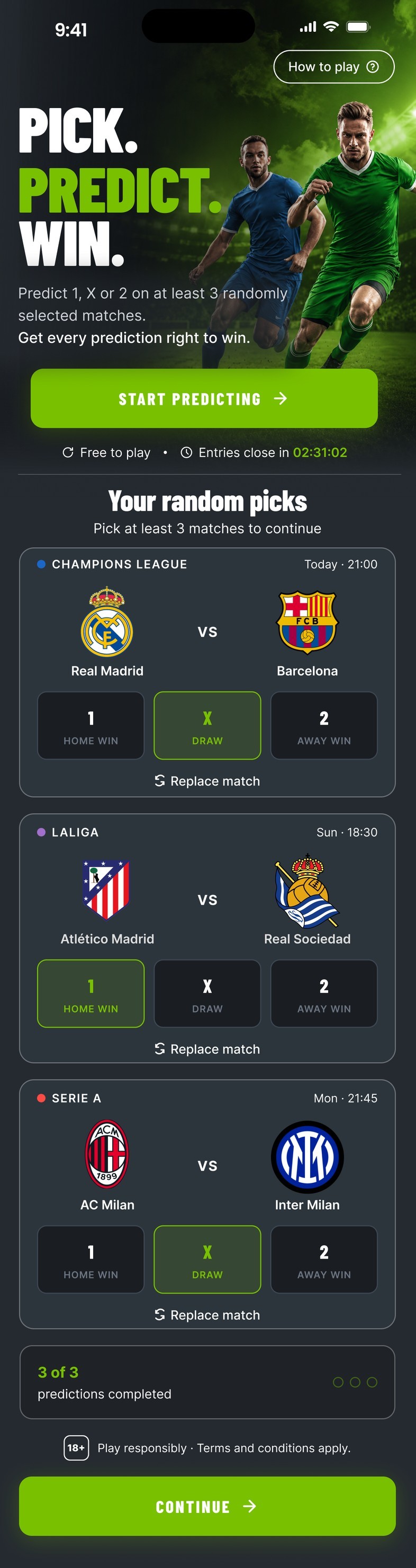
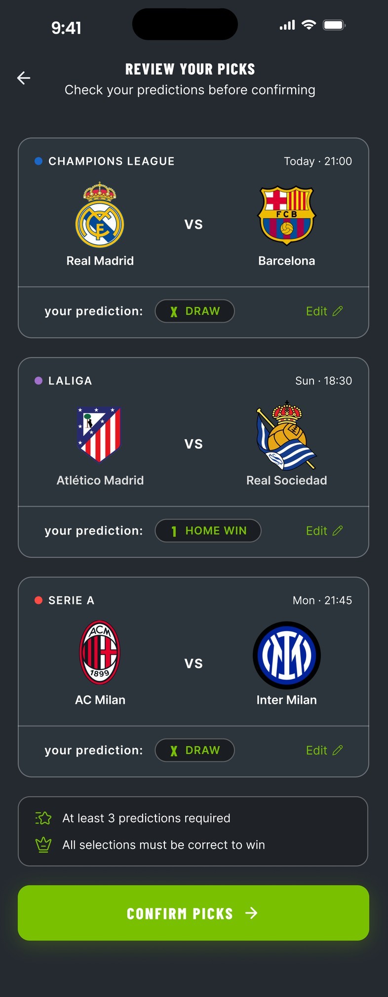
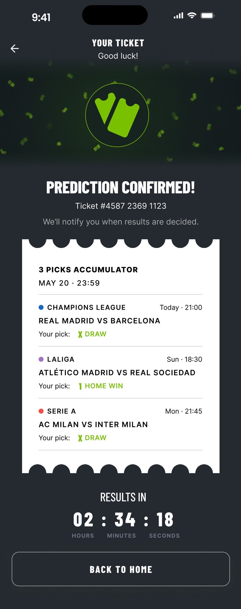
Brand logo removed and copy errors fixed for publication. Everything else is shown as submitted.
Your random picks.
A working model of the submitted flow. Pick 1, X or 2 on all three matches, replace one if you like, review, then confirm.
- 1Get three random matches. Replace any of them.
- 2Predict 1, X or 2 on each one.
- 3Review your picks, then confirm.
- 4Get every prediction right to win.
Demo only. Free to play, nothing is placed, and the fixtures are examples. Club crests belong to their clubs.
 Real Madrid
 Barcelona
 Atlético Madrid
 Real Sociedad
 AC Milan
 Inter Milan
Assumptions helped
me move. Data decides.
AI sped it up.
I owned the calls.
Where AI helped. Critique, alternative directions, microcopy exploration and test planning.
What stayed mine. Strategy and priorities, stakeholder alignment, ethics and responsible gaming, and local cultural context.
What I'd still ask for. Before production: the technical constraints, historical benchmarks, and the regulatory requirements in each market.
What I'd check first with real users. Whether 1 · X · 2 needs words. It's the one assumption the whole flow rests on.