After the interview, I revisited a three-day fleet dashboard and turned a crowded monitoring screen into a prioritized action queue.
Product design exercise · 3 days · Solo
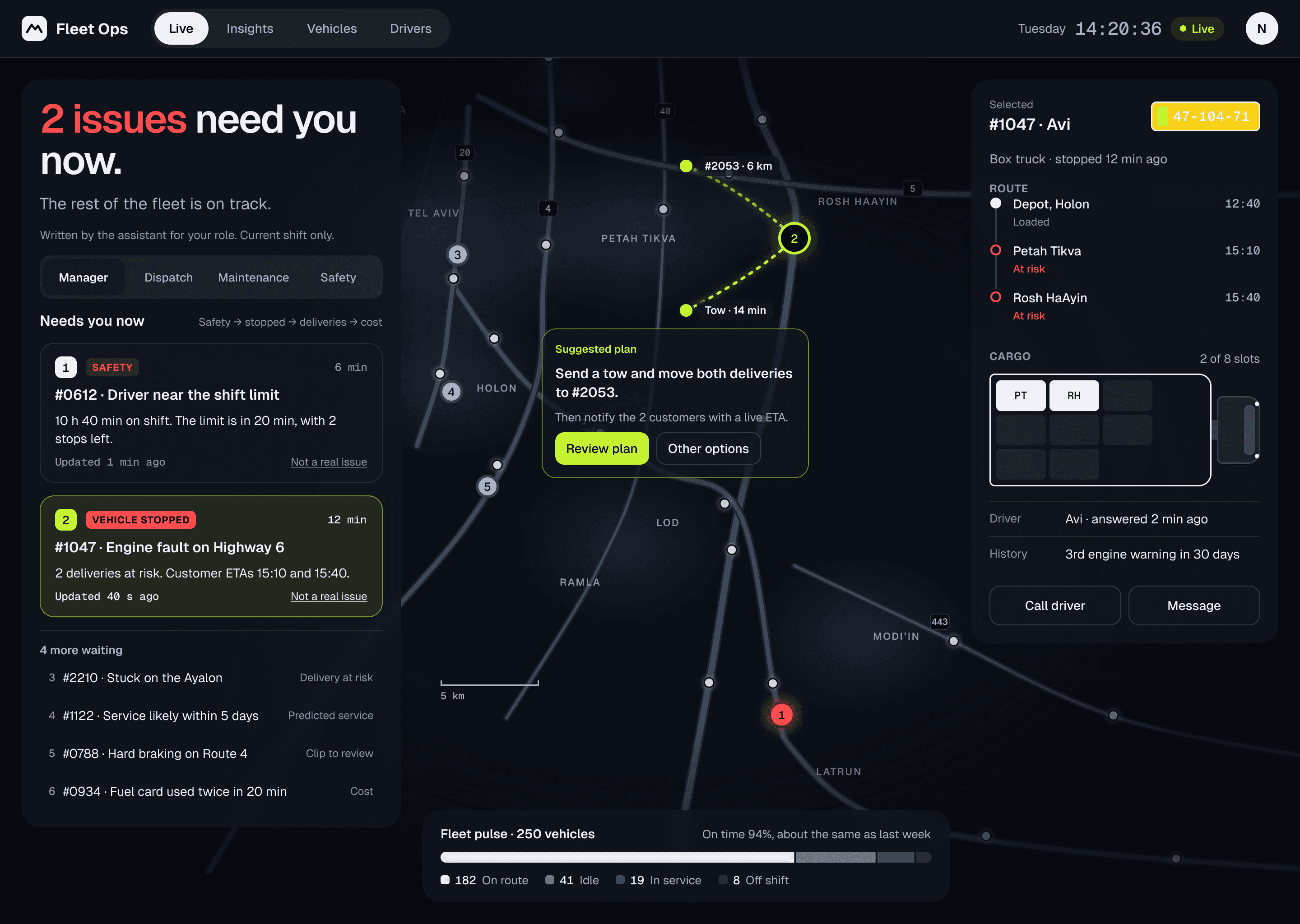
The reworked dashboard. Fictional fleet data.
01 / THREE DAYS
What I made in three days.
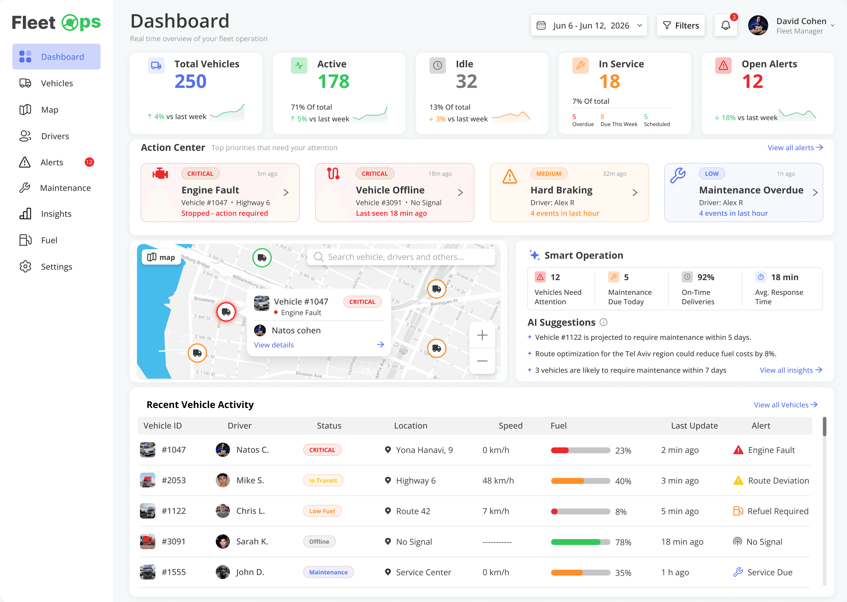
The brief: a dashboard that helps fleet managers monitor vehicles in real time and act on what matters, plus research on comparable platforms and the gaps they leave. I reviewed four platforms, wrote a persona and built a dashboard around five initial assumptions. I used AI tools and worked by hand in Figma. The hiring company and reviewers are anonymized.
1234
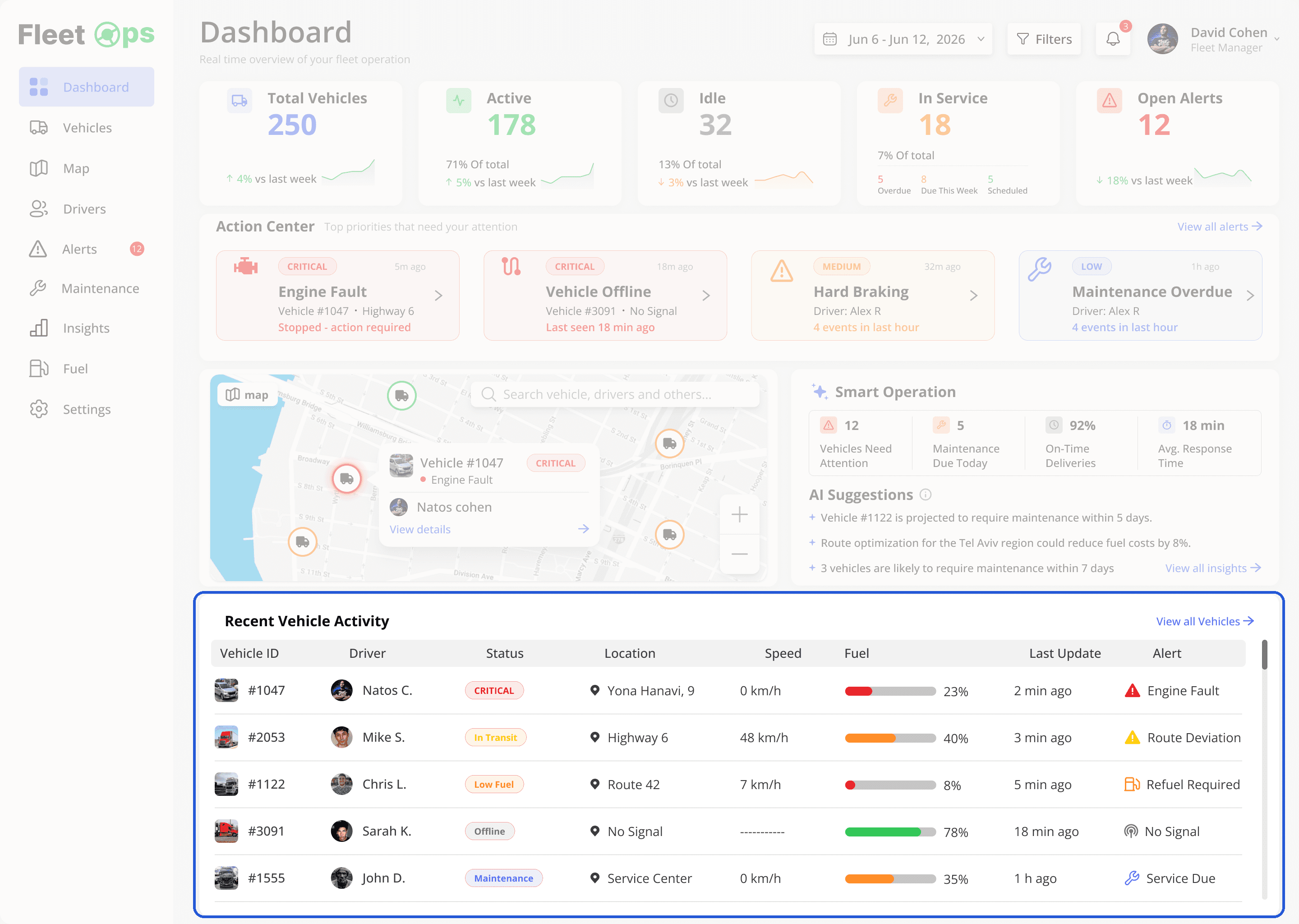
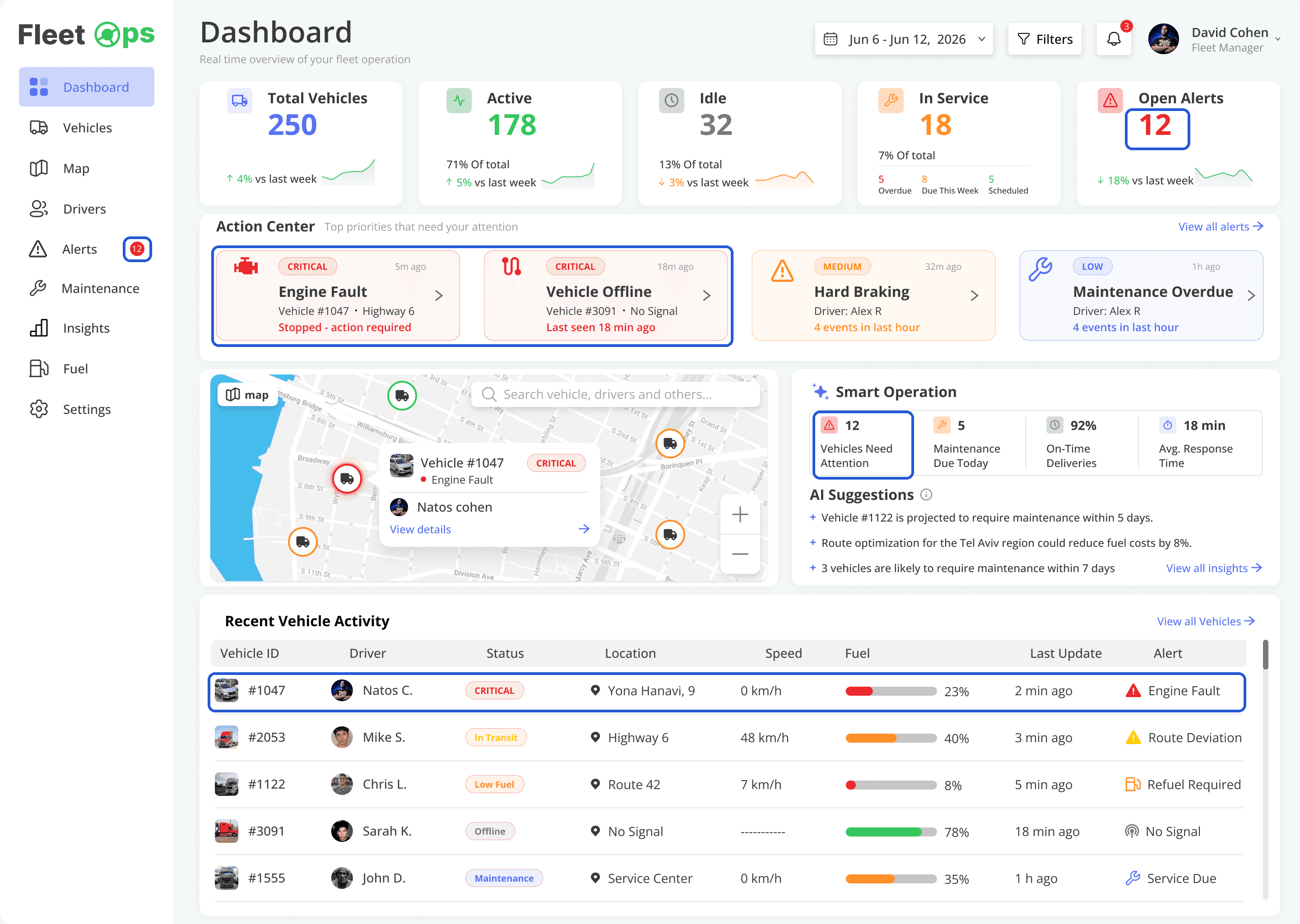
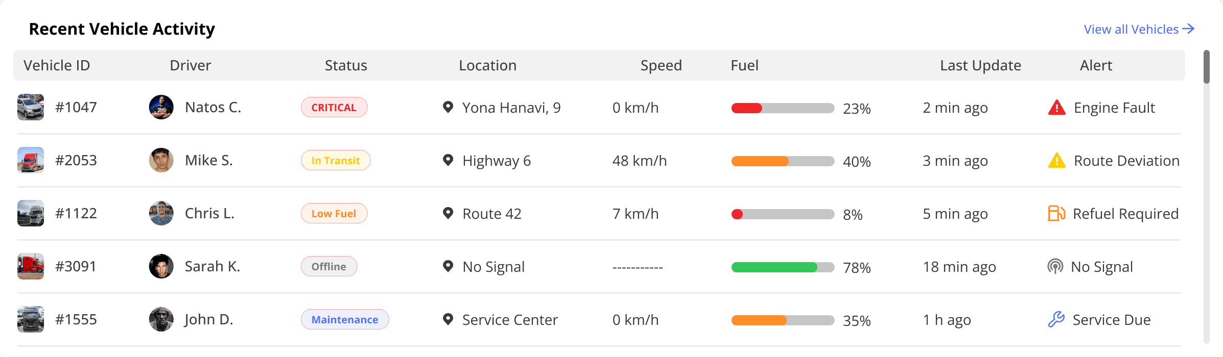
1 · KPI rowThe whole fleet at a glance.
2 · Action CenterWhat needs attention, surfaced.
3 · MapWhere everything is, in real time.
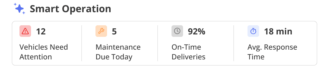
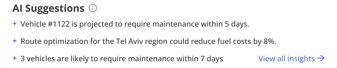
4 · Smart Operation + AIRecommendations, not just data.
The instincts were right. My own research said managers need decisions, not more data. But the screen gave every idea the same weight, so nothing led.
02 / THE FEEDBACK
Then the feedback came in.
The hiring company’s head of design said it felt dated, generic and cluttered, the AI wasn’t strong enough, and there was nothing he hadn’t seen before. When I shared it on LinkedIn, designers said much the same.
No single goalEverything looks urgentAI without actionGeneric, not domain-specificUI craft
“The user gets a lot of data and zero critical information.”
Design lead
“You could replace the brand, and even the market category, and it would still be ‘fine’.”
Product designer
“If the AI is just insights, should it be on the dashboard at all?”
Before changing a pixel, I read my own work the way a reviewer would.
01
I presented these as findings. They weren’t.
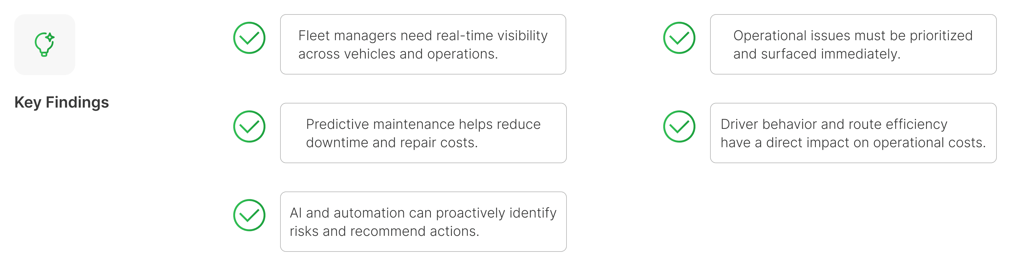
Five “Key Findings,” and no source behind any of them. They restated the brief and what the platforms say about themselves, not anything a fleet manager told me.
02
My own research said: less data, more decisions. Then I designed more data.
Three of my slides said managers don’t need more data. The biggest thing on the screen was a raw vehicle table.
03
The same problem, five times.
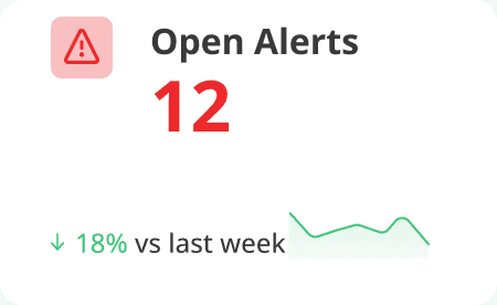
The same 12 open alerts showed up in the nav badge, the KPI card, Smart Operation, the alert cards and the table.
04
You could swap the brand, even the industry.
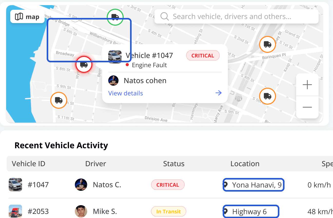
Broadway and the Williamsburg Bridge on the map. Highway 6 and Yona Hanavi Street in the table. Nothing on the screen belonged to one real place.
The headline quotes a reviewer.
The UI had real issues too, but fixing pixels without fixing the story wouldn’t change anything.
04 / CHECKING MY FINDINGS
What 100 reviews said back.
My five “findings” had no sources, so I revisited them using 100 public reviews of four fleet platforms. Written by buyers, admins and managers, mostly in US trucking and construction. Desk research, not field research.
Real-time visibility across vehicles and operationsHeld
Table stakes. The pain is lag and trust.
Issues must be prioritized and surfaced immediatelyPartly
The problem is noise and trust, not speed.
Predictive maintenance reduces downtime and costsPartly
Users value reminders and history. “Predictive” appears once.
Driver behavior and route efficiency drive costsPartly
Safety is big. Route efficiency: 0 mentions.
AI can identify risks and recommend actionsNot tested
All AI mentions concern detection; none concern recommendations.
THE GAPS THE TOOLS LEAVE, AND WHAT THE REWORK ANSWERS
Buried answers
One ranked queue.
Alerts without trust
Freshness on every issue, and “Not a real issue” feeds the ranking.
One screen for many jobs
The same queue, ranked for each role.
05 / WHAT CHANGED
What changed after the feedback?
The original spreads attention across cards, alerts and a table. The rework brings the next decision into one ranked queue. Compare where your eye goes first.
Submitted dashboardMove the slider to compareReworked dashboard
SUBMITTED · DAY 3SUBMITTEDREWORKED · AFTER THE FEEDBACKREWORKED⇆
The same fleet and engine fault, with a different information hierarchy. Screens use fictional data. The comparison moves only when you move the slider.
06 / HOW THE STRUCTURE CHANGED
Every piece found its place.
The rework didn’t start from zero. Each part of the original had a job worth keeping. It just needed a rank.
FROM · OPEN ALERTS KPI
→
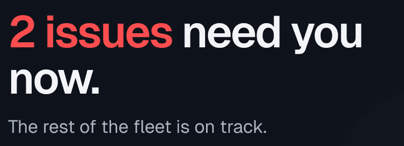
TO · NEEDS YOU NOW
A number became a sentence.
“12 open alerts” became the two that need you now, and a clear “the rest is on track.”
FROM · ACTION CENTER
→
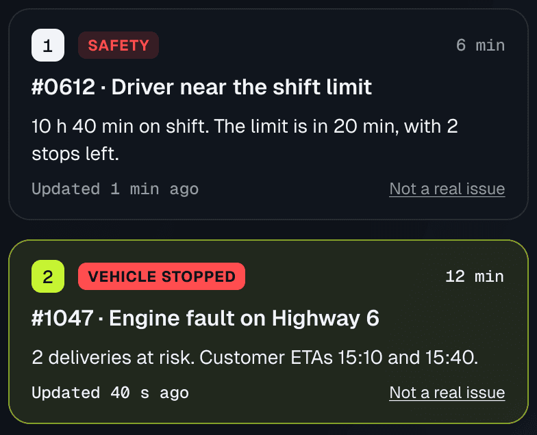
TO · THE QUEUE
Four equal cards became one ranked queue.
Safety first, then stopped vehicles and deliveries, then cost.
FROM · LIVE MAP
→
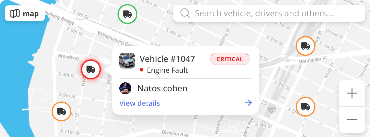
TO · THE MAP
New York streets became central Israel, at real scale.
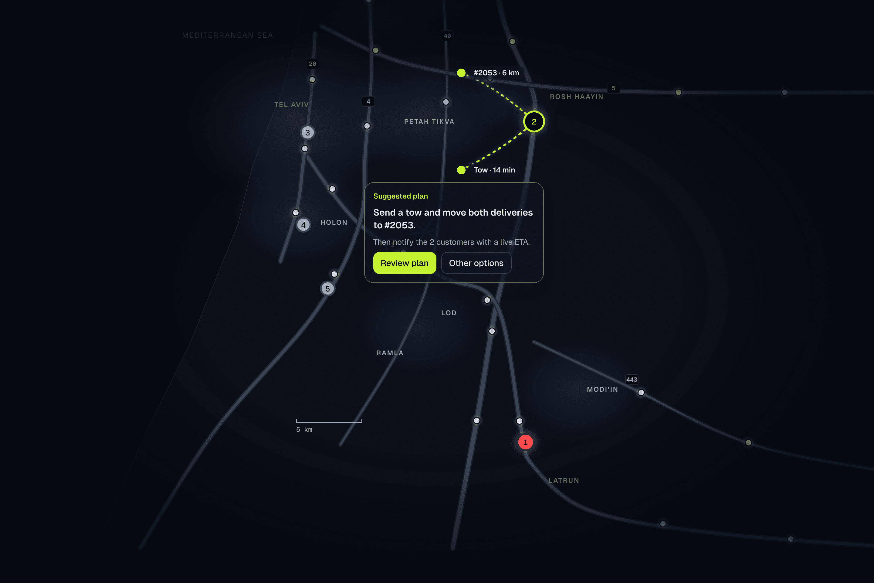
The map shows the whole fleet. The queue decides what gets highlighted.
FROM · SMART OPERATION
→
TO · FLEET PULSE
Four counters became one quiet strip.
Trends are words. Color stays secondary.
FROM · AI SUGGESTIONS
→
TO · THE PLAN
Three generic tips became a plan per issue.
The manager reviews it, edits it or picks another option.
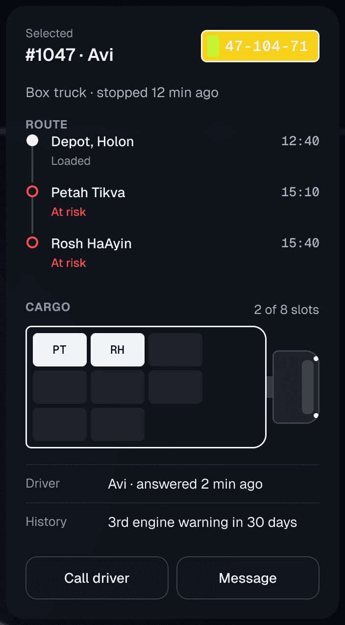
FROM · RECENT VEHICLE ACTIVITY
→
TO · SELECTED VEHICLE
Half the screen became one panel.
It opens with the issue, and shows only the vehicle that needs you.
01
07 / PRIORITY
Triage, not overview.
One queue, ranked by impact. The manager can see who needs attention now, then inspect the issue before deciding what to do.
A closer look at the queue, the entry point for action.
1
One ranked queue.
The same issue appears once, not five times. Safety first, then stopped vehicles and deliveries, then cost.
2
A real map, at real scale.
The map shows the whole fleet across central Israel. The queue decides what gets highlighted on it.
3
One quiet strip.
Fleet pulse replaces the KPI cards and counters. Trends are words, and color stays secondary.
THE SAME QUEUE, FOR EACH ROLE
FLEET MANAGER
2 issues need you now. The rest of the fleet is on track.
DISPATCHER
2 vehicles have deliveries at risk. The rest is on schedule.
MAINTENANCE
1 vehicle is down. 1 more is likely to need service this week.
SAFETY
1 driver is near the shift limit. 1 clip is waiting for review.
02
08 / HUMAN CONTROL
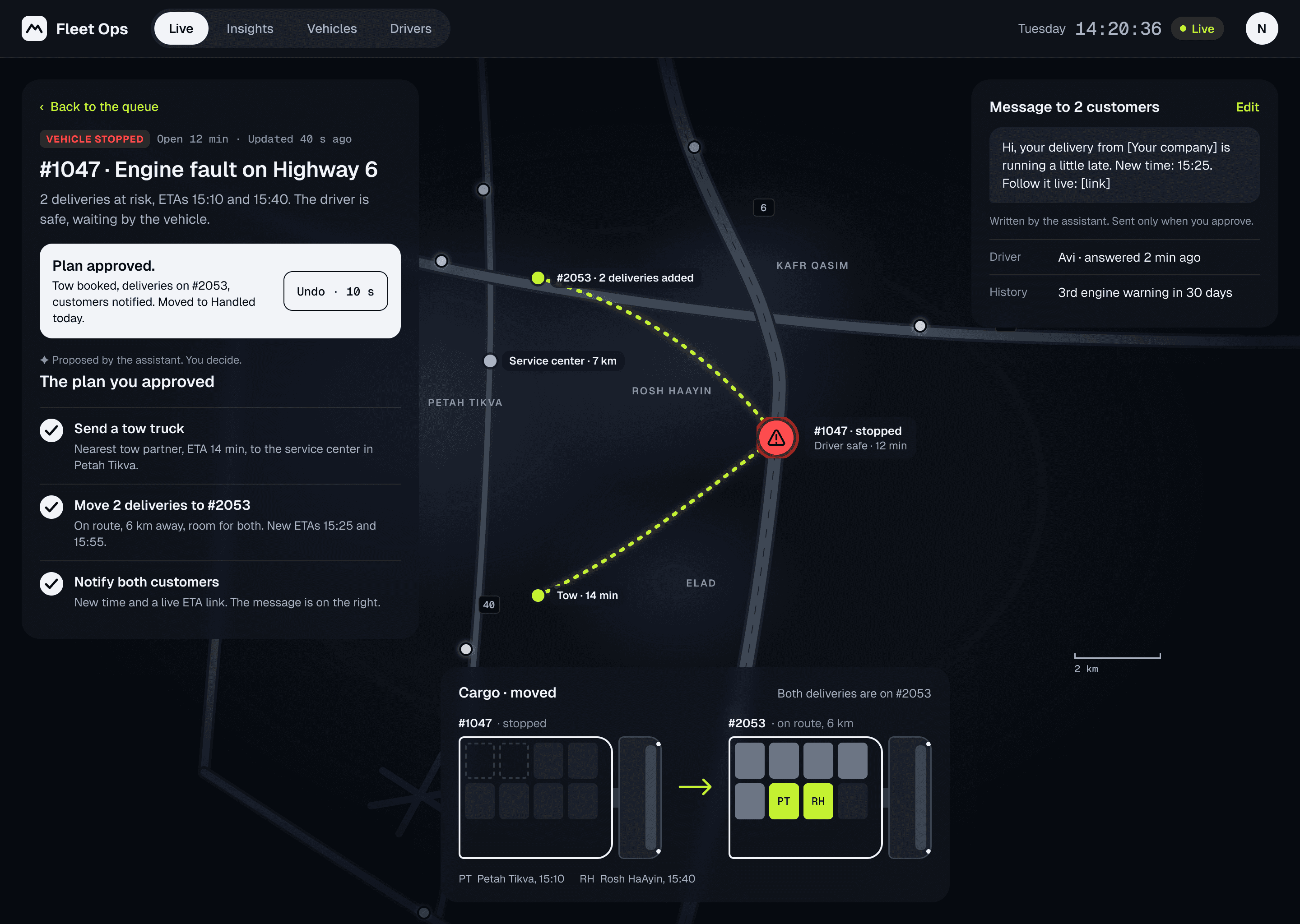
The AI drafts a plan. The manager decides.
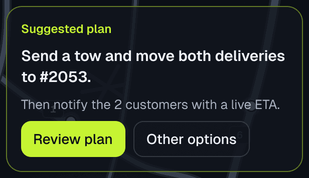
#1047 stopped on Highway 6 with two deliveries on board. The plan: send a tow, move both deliveries to #2053, and tell the customers.
✦ Proposed by the assistant. You decide.
Tow, move the deliveries, tell the customers
1
Send a tow truck
Nearest tow partner, 14 min, to the service center 7 km away.
2
Move 2 deliveries to #2053
En route, 6 km away, with room for both. New ETAs: 15:25 and 15:55.
3
Notify both customers
New time and a live ETA link, message already written.
Proposed move
#1047 · stopped
PTRH
→
#2053 · en route, 6 km
PTRH
PT · Petah Tikva, 15:10 RH · Rosh HaAyin, 15:40
CONCEPT BEHAVIOR TO TEST · WHEN IT’S UNSURE
“The driver isn’t answering. Should I call the dispatcher, or message the driver?” The AI asks. It doesn’t act.
CONCEPT BEHAVIOR TO TEST · WHEN THERE’S NO WAY
No free vehicle within 20 km: the plan says so, offers to delay the deliveries to 17:30, and has the customer message ready.
Proposed. Nothing happens until the manager approves.Approved. Change plan remains available.
03
09 / SCOPE
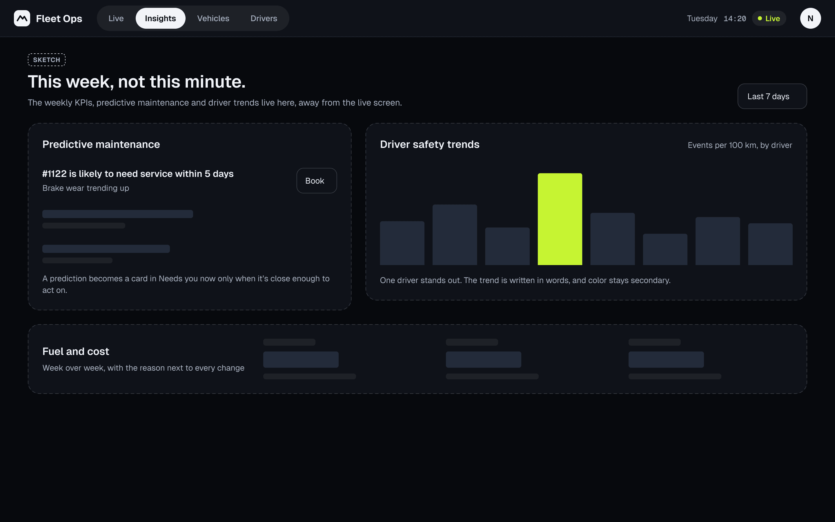
The weekly view has its own home.
Predictive maintenance, driver trends and cost moved to Insights. The old KPIs had a home, just not on the live screen.
ONE COMPONENT SET, DAY AND NIGHT MODES
VEHICLE STOPPED#1047 · Engine fault on Highway 6Day mode · deskVEHICLE STOPPED#1047 · Engine fault on Highway 6Night mode · control room
10 / REFLECTION
What I’d still question.
The rework is a finished portfolio exploration, not a shipped product. These are the bets I would test next.
What changed in how I work with AI. The first version used AI to produce screens fast, and it showed: a reviewer said you could swap the brand and even the industry. Now the order is reversed. I decide the story and the priorities first, and use AI where it’s strong: synthesizing 100 reviews, exploring alternatives, drafting copy I then edit.
The AI plan is a bet. In 100 reviews of four fleet platforms, AI came up only as detection, never as recommendations. So I’d measure it before trusting it.
What I’d measure. Time from an issue appearing to the first action. Share of issues resolved from the dashboard without opening another screen. How often managers accept the AI’s plan as is, edit it, or reject it.
What I’d still question. Whether one ranked queue still works at 2,000 vehicles, and how the AI’s ranking earns the manager’s trust. My first test would be to show the queue next to the manager’s own priority list and compare.
04 / TAKE-HOME · REVISITED
Who needs me now?
After the interview, I revisited a three-day fleet dashboard and turned a crowded monitoring screen into a prioritized action queue.
Product design exercise · 3 days · Solo
The reworked dashboard. Fictional fleet data.
01 / THREE DAYS
What I made in three days.
The brief: a dashboard that helps fleet managers monitor vehicles in real time and act on what matters, plus research on comparable platforms and the gaps they leave. I reviewed four platforms, wrote a persona and built a dashboard around five initial assumptions. I used AI tools and worked by hand in Figma. The hiring company and reviewers are anonymized.
1234
1 · KPI rowThe whole fleet at a glance.
2 · Action CenterWhat needs attention, surfaced.
3 · MapWhere everything is, in real time.
4 · Smart Operation + AIRecommendations, not just data.
The instincts were right. My own research said managers need decisions, not more data. But the screen gave every idea the same weight, so nothing led.
02 / THE FEEDBACK
Then the feedback came in.
The hiring company’s head of design said it felt dated, generic and cluttered, the AI wasn’t strong enough, and there was nothing he hadn’t seen before. When I shared it on LinkedIn, designers said much the same.
No single goalEverything looks urgentAI without actionGeneric, not domain-specificUI craft
“The user gets a lot of data and zero critical information.”
Design lead
“You could replace the brand, and even the market category, and it would still be ‘fine’.”
Product designer
“If the AI is just insights, should it be on the dashboard at all?”
Before changing a pixel, I read my own work the way a reviewer would.
01
I presented these as findings. They weren’t.
Five “Key Findings,” and no source behind any of them. They restated the brief and what the platforms say about themselves, not anything a fleet manager told me.
02
My own research said: less data, more decisions. Then I designed more data.
Three of my slides said managers don’t need more data. The biggest thing on the screen was a raw vehicle table.
03
The same problem, five times.
The same 12 open alerts showed up in the nav badge, the KPI card, Smart Operation, the alert cards and the table.
04
You could swap the brand, even the industry.
Broadway and the Williamsburg Bridge on the map. Highway 6 and Yona Hanavi Street in the table. Nothing on the screen belonged to one real place.
The headline quotes a reviewer.
The UI had real issues too, but fixing pixels without fixing the story wouldn’t change anything.
04 / CHECKING MY FINDINGS
What 100 reviews said back.
My five “findings” had no sources, so I revisited them using 100 public reviews of four fleet platforms. Written by buyers, admins and managers, mostly in US trucking and construction. Desk research, not field research.
Real-time visibility across vehicles and operationsHeld
Table stakes. The pain is lag and trust.
Issues must be prioritized and surfaced immediatelyPartly
The problem is noise and trust, not speed.
Predictive maintenance reduces downtime and costsPartly
Users value reminders and history. “Predictive” appears once.
Driver behavior and route efficiency drive costsPartly
Safety is big. Route efficiency: 0 mentions.
AI can identify risks and recommend actionsNot tested
All AI mentions concern detection; none concern recommendations.
THE GAPS THE TOOLS LEAVE, AND WHAT THE REWORK ANSWERS
Buried answers
One ranked queue.
Alerts without trust
Freshness on every issue, and “Not a real issue” feeds the ranking.
One screen for many jobs
The same queue, ranked for each role.
05 / WHAT CHANGED
What changed after the feedback?
The original spreads attention across cards, alerts and a table. The rework brings the next decision into one ranked queue. Compare where your eye goes first.
Submitted dashboardMove the slider to compareReworked dashboard
SUBMITTED · DAY 3SUBMITTEDREWORKED · AFTER THE FEEDBACKREWORKED⇆
The same fleet and engine fault, with a different information hierarchy. Screens use fictional data. The comparison moves only when you move the slider.
06 / HOW THE STRUCTURE CHANGED
Every piece found its place.
The rework didn’t start from zero. Each part of the original had a job worth keeping. It just needed a rank.
FROM · OPEN ALERTS KPI
→
TO · NEEDS YOU NOW
A number became a sentence.
“12 open alerts” became the two that need you now, and a clear “the rest is on track.”
FROM · ACTION CENTER
→
TO · THE QUEUE
Four equal cards became one ranked queue.
Safety first, then stopped vehicles and deliveries, then cost.
FROM · LIVE MAP
→
TO · THE MAP
New York streets became central Israel, at real scale.
The map shows the whole fleet. The queue decides what gets highlighted.
FROM · SMART OPERATION
→
TO · FLEET PULSE
Four counters became one quiet strip.
Trends are words. Color stays secondary.
FROM · AI SUGGESTIONS
→
TO · THE PLAN
Three generic tips became a plan per issue.
The manager reviews it, edits it or picks another option.
FROM · RECENT VEHICLE ACTIVITY
→
TO · SELECTED VEHICLE
Half the screen became one panel.
It opens with the issue, and shows only the vehicle that needs you.
01
07 / PRIORITY
Triage, not overview.
One queue, ranked by impact. The manager can see who needs attention now, then inspect the issue before deciding what to do.
A closer look at the queue, the entry point for action.
1
One ranked queue.
The same issue appears once, not five times. Safety first, then stopped vehicles and deliveries, then cost.
2
A real map, at real scale.
The map shows the whole fleet across central Israel. The queue decides what gets highlighted on it.
3
One quiet strip.
Fleet pulse replaces the KPI cards and counters. Trends are words, and color stays secondary.
THE SAME QUEUE, FOR EACH ROLE
FLEET MANAGER
2 issues need you now. The rest of the fleet is on track.
DISPATCHER
2 vehicles have deliveries at risk. The rest is on schedule.
MAINTENANCE
1 vehicle is down. 1 more is likely to need service this week.
SAFETY
1 driver is near the shift limit. 1 clip is waiting for review.
02
08 / HUMAN CONTROL
The AI drafts a plan. The manager decides.
#1047 stopped on Highway 6 with two deliveries on board. The plan: send a tow, move both deliveries to #2053, and tell the customers.
✦ Proposed by the assistant. You decide.
Tow, move the deliveries, tell the customers
1
Send a tow truck
Nearest tow partner, 14 min, to the service center 7 km away.
2
Move 2 deliveries to #2053
En route, 6 km away, with room for both. New ETAs: 15:25 and 15:55.
3
Notify both customers
New time and a live ETA link, message already written.
Proposed move
#1047 · stopped
PTRH
→
#2053 · en route, 6 km
PTRH
PT · Petah Tikva, 15:10 RH · Rosh HaAyin, 15:40
CONCEPT BEHAVIOR TO TEST · WHEN IT’S UNSURE
“The driver isn’t answering. Should I call the dispatcher, or message the driver?” The AI asks. It doesn’t act.
CONCEPT BEHAVIOR TO TEST · WHEN THERE’S NO WAY
No free vehicle within 20 km: the plan says so, offers to delay the deliveries to 17:30, and has the customer message ready.
Proposed. Nothing happens until the manager approves.Approved. Change plan remains available.
03
09 / SCOPE
The weekly view has its own home.
Predictive maintenance, driver trends and cost moved to Insights. The old KPIs had a home, just not on the live screen.
ONE COMPONENT SET, DAY AND NIGHT MODES
VEHICLE STOPPED#1047 · Engine fault on Highway 6Day mode · deskVEHICLE STOPPED#1047 · Engine fault on Highway 6Night mode · control room
10 / REFLECTION
What I’d still question.
The rework is a finished portfolio exploration, not a shipped product. These are the bets I would test next.
What changed in how I work with AI. The first version used AI to produce screens fast, and it showed: a reviewer said you could swap the brand and even the industry. Now the order is reversed. I decide the story and the priorities first, and use AI where it’s strong: synthesizing 100 reviews, exploring alternatives, drafting copy I then edit.
The AI plan is a bet. In 100 reviews of four fleet platforms, AI came up only as detection, never as recommendations. So I’d measure it before trusting it.
What I’d measure. Time from an issue appearing to the first action. Share of issues resolved from the dashboard without opening another screen. How often managers accept the AI’s plan as is, edit it, or reject it.
What I’d still question. Whether one ranked queue still works at 2,000 vehicles, and how the AI’s ranking earns the manager’s trust. My first test would be to show the queue next to the manager’s own priority list and compare.
 1234
1234